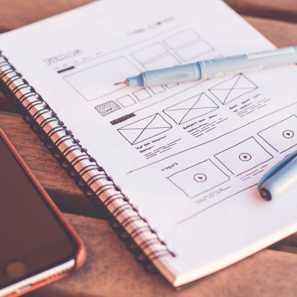
Good user experience feels effortless, but it is the result of many deliberate choices. Teams that follow a handful of proven principles ship products people enjoy using and recommend to others. These best practices apply whether you design an app, a website or a service.
Start with user research
Talk to real users before drawing screens. Interviews and observation reveal goals, habits and frustrations that no assumption can match.
Even five conversations can change the direction of a project. Research is the cheapest way to avoid building the wrong thing, and it pays back many times over.
Define clear goals and tasks
List the three most important things a user wants to do and design for those first. Everything else is secondary.
A product that tries to do everything tends to do nothing well. Clear priorities guide every layout and every sentence.
Keep navigation simple
People should always know where they are, where they can go and how to return. Use familiar labels and a consistent structure.
Limit main menu items to a small number. If you need more, group them logically and test the grouping with real users.
Follow proven heuristics
A classic set of ten usability principles remains useful decades later. They cover visibility of system status, error prevention, consistency and flexibility.
The Nielsen Norman Group usability heuristics make a great checklist for design reviews.
Use visual hierarchy
Size, color and spacing tell people what to read first. Headlines, buttons and key numbers should stand out, while secondary details recede.
Squint at your screen. If you cannot tell what matters most, the hierarchy needs work.
Write helpful microcopy
Button labels, error messages and hints guide users at moments of doubt. Say what will happen in plain words.
Replace vague messages such as error occurred with specific advice. A friendly sentence can save a customer from leaving.
Design for accessibility
Sufficient contrast, keyboard access, readable text and meaningful labels help people with disabilities and everyone using a phone in bright sun.
Accessibility should be part of the first sketch, not a late patch. It improves quality and widens your audience.
Make forms short and forgiving
Ask only for information you need and show progress in long processes. Validate fields as users type and explain how to fix mistakes.
Remember that every extra field lowers completion. Small cuts often raise sign ups noticeably.
Speed is part of design
Slow pages frustrate users and damage trust. Compress images, reduce scripts and show loading states.
Fast feedback after a tap makes an app feel responsive. Seconds matter more than many teams expect.
Prototype and test early
Low fidelity sketches and clickable prototypes expose problems before developers start. Ask people to complete tasks while you watch silently.
Fix the largest issues first, then test again. Several small rounds beat one big final test.
Design for international users
Users expect products in their own language and conventions. Text expands, dates change and some scripts run right to left or need larger spacing.
Teams planning launches in Southeast Asia often involve Vietnamese translation services early, so layouts can be tested with real text and tone.
Plan for text expansion
German and Finnish words are long, and many languages need more space than English. Buttons and menus must flex without breaking.
Our guide to German to English translation shows how length and structure change between languages, which helps designers prepare layouts.
Keep design systems alive
A shared library of components keeps products consistent and speeds up work. Document usage rules and update them with each release.
Treat the system as a product with owners and a roadmap. A neglected library quickly becomes a source of inconsistency.
Collaborate with developers early
Include engineers in design discussions to find technical limits and opportunities. Early talks prevent expensive redesigns.
Share the reasons behind decisions, not only the files. Understanding creates better implementation.
Measure after launch
Combine analytics with feedback. Look at where users drop off, which features they use and what they ask support about.
Numbers show what happens and interviews show why. Both are required to improve a product responsibly.
Respect user privacy and honesty
Avoid dark patterns that trick users into subscriptions or sharing data. Short term gains erode trust.
Clear consent flows and fair pricing are signs of a design culture that respects people.
Keep learning and iterating
Tools, devices and habits change. Study other products, attend critiques and read research.
Good design is never finished. Teams that keep listening, testing and improving will always outpace those that stop after launch.
Use real content in designs
Placeholder text hides problems with length, tone and hierarchy. Fill prototypes with realistic names, prices and sentences as soon as possible.
Real content reveals awkward line breaks and empty states early, when changes are still inexpensive and quick.
Design the empty and error states
Users meet empty lists, failed uploads and lost connections more often than designers expect. A helpful message with a clear next step keeps them calm.
These small moments shape how reliable your product feels, and they are often forgotten until late.