Good design is invisible. Nobody praises a login screen that simply works, yet everyone remembers one that frustrates them. User experience design has moved from a nice extra to a core business skill, and the trends shaping it right now reveal how people actually want to interact with digital products.
Simplicity Wins Again
Users scan, they do not read. Interfaces with clear hierarchy, generous spacing and a single main action outperform crowded layouts.
Every extra option is a decision the user must make, so remove what does not help the task.
Accessibility as a Standard
Designers now treat contrast, keyboard navigation, readable text and screen reader support as basic requirements. These improvements help everyone, including people using phones in bright sunlight.
Testing with real users who have disabilities reveals problems that checklists miss.
Dark Mode and Visual Comfort
Many apps offer light and dark themes. Good implementations maintain contrast, adjust images and respect system settings.
Do not simply invert colors. Design each theme carefully.
Microinteractions Add Meaning
Small animations that confirm a tap, show progress or guide attention make products feel responsive. They should be quick and purposeful.
Avoid decorative motion that slows people down or causes discomfort.
Personalization Without Creepiness
Interfaces that remember preferences and surface relevant content save time. Explain what data you use and give users control.
Transparent personalization builds trust instead of suspicion.
Voice and Conversational Interfaces
Chat assistants and voice commands are now common. Their quality depends on clear language, helpful fallbacks and graceful handling of errors.
Always offer a human path when the system cannot solve the problem.
Design Systems Scale Teams
Shared libraries of components, colors and guidelines keep products consistent and speed up development. They also reduce arguments about details.
Maintain them like a product, with owners, documentation and regular updates.
Research Before Pixels
Interviews, usability tests and analytics show where users struggle. Even five test sessions can reveal major issues.
Research from groups like the Nielsen Norman Group has shown for years that early testing saves money later.
Mobile-First Thinking
Most first visits happen on phones. Large tap targets, short forms and thumb-friendly navigation are essential.
Test on real devices and slow connections, not only on a designer laptop.
Designing for Many Languages
Text length changes when interfaces are translated. German words can be much longer than English ones, and some scripts need more vertical space.
Plan flexible layouts and test early with real strings, including professional english to greek ui translation for Greek or other alphabets.
Managing Translation Workflows
Product teams ship updates constantly, so copy changes must flow smoothly to linguists and back. Manual file exchange causes delays and errors.
Our overview of a translation management system explains how modern tools keep designers, developers and translators aligned.
Right-to-Left Layouts
Languages such as Arabic and Hebrew mirror layouts, icons and navigation. Planning for this from the start is easier than retrofitting.
Test numbers, mixed text and punctuation carefully.
Content Is Part of Design
Words are interface elements. Clear button labels, helpful error messages and friendly tone shape the whole experience.
Involve writers early and test copy as seriously as visuals.
Ethical Design
Dark patterns that trick users into subscriptions or sharing data damage trust and invite regulation. Design choices should respect attention and consent.
Ask whether you would be comfortable explaining the design to the user directly.
Performance Is UX
Slow pages frustrate people more than ugly ones. Optimize images, reduce scripts and measure real loading experience.
Speed is a feature that every user notices instantly.
Prototyping and Collaboration
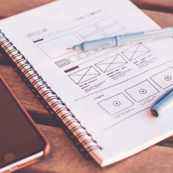
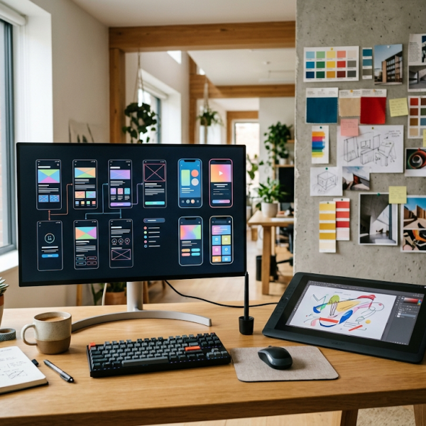
Interactive prototypes let teams test ideas before development. Cloud tools allow designers, developers and stakeholders to comment in one place.
Share early drafts and welcome critique.
Measure What Matters
Track task success, time to complete and satisfaction, not only visits. Combine numbers with user comments to understand why behavior changes.
Small design adjustments often produce large gains in completion rates.
Learning From Design Battles
Comparing two competing designs side by side teaches more than reading theory. Ask which one helps users finish the task with less effort.
Explain the reasons, so the whole team learns.
Building a Career in UX
Combine curiosity about people with skills in research, visual design and communication. Build a portfolio that shows process, not just screens.
Stay open to feedback and keep learning.
What Comes Next
Expect more adaptive interfaces, spatial computing and intelligent assistants. The fundamentals remain the same: understand people, remove friction and respect their time.
Designers who stay focused on those basics will create products people enjoy using.
Onboarding Experiences
The first minutes decide whether people stay. Show value quickly, ask for the minimum information and let users skip optional steps.
Progress indicators and friendly examples reduce anxiety during setup.
Error Messages That Help
Explain what happened, why it matters and how to fix it, in plain language. Blame never helps the user.
Good messages turn failure into a small moment of trust.